Use charts to visualize and explore your data. In this lesson, you'll add a pie chart, a bar chart and a Geo chart to this report.
How to add a chart
To add a chart to the current page:
- Edit your report.
- Navigate to the page that will contain the chart.
- In the toolbar, click Add a chart.
- Select the chart you want to add.
- Click the canvas to add the chart to the report.
- Select one or more charts to move or resize them as needed.
Step 1: Add a pie chart
 Use a pie chart to give a general comparison of a small number of metrics or variables.

- Following the steps in [How to add a chart](#how-to-add-a-chart), add a Pie Chart to the report.
- In the Properties panel, select the SETUP tab.
- Click the Source dimension chip to access the Dimension Picker.
- Click the User Type dimension.
- Click the STYLE tab.
- Use the donut slider to change the solid shape to a ring shape.

- Use the Legend property to position the metric labels under the pie:

Step 2: Add a bar chart
Bar charts are great for showing and comparing the magnitude of multiple variables.
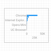
- Following the steps in How to add a chart, add a Bar Chart to the report.
- In the Properties panel, select the SETUP tab.
- Click the Source dimension and change it to Browser.
- Click the return arrow:

- Click the Sessions metric and change it to Users.
- Click the STYLE tab.
- Change the orientation to Horizontal :

- Scroll to the Background and Border section of the STYLE tab.
- Set the Border color to gray:

Step 3: Add a Google Map
Use a Google Map to see the distribution of sessions (or other metrics) across the world.
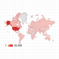
- Following the steps in How to add a chart, add a Google Map to the report. Choose the bubble map style.
- In the Properties panel, select the SETUP tab.
- Click the default Location field and replace it with the City dimension.
- Add metrics for bubble color and bubble size. For example, select Sessions for Size, and Average time on Page for Color.
- Select the Style tab.
- Use the sliders to adjust the background details, such as roads, landmarks, and labels.
- In the Colors section, select colors for the range of metric values.
- In the Map Controls section, turn on or off the map controls you want to let your viewers use.
- View your report. Pan, zoom, and scroll. You can also use Street View!
Next step
Congratulations! You've created your first Looker Studio report!
If you'd like, add titles, change colors and styles, add more visualizations. When you're ready to move on, begin the next lesson: View and share your report.
Related resources
Types of charts in Looker Studio